TYPE DESIGN & BRANDING
At Seven 9 Signs we create branding that aligns with your vision and identity. We use our creativity and bespoke hand lettering skills to shape that vision into distinctive brand elements before delivering them as digital assets for use across web, print and wider applications. Whether it is a new identity, a brand refresh or a one off project, we build branding with strong visual presence and a sense of character that resonates.
We also design and draw custom typography by hand for brands, campaigns, studios and anyone who needs lettering with real character. Every letter begins as a sketch shaped to suit the message, the surface and the personality of the project before being developed into digital assets or bespoke font libraries for consistent use across print, web and wider applications. We work with traditional techniques, careful line work and strong composition so the finished type holds its shape and presence wherever it is used.
TYPE DESIGN & BRANDING GALLERY
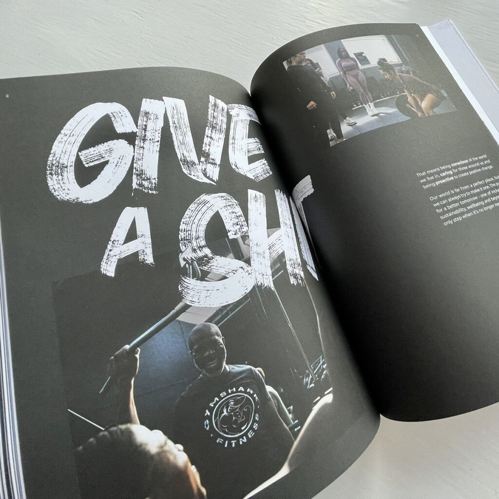
This project saw us collaborate with Gymshark to create a completely bespoke hand rendered alphabet and set of glyphs for their internal brand book. Every letter was painted by hand, focusing on energy, movement and character rather than perfection.
Once complete, the full alphabet was carefully digitised and supplied as clean digital files, giving Gymshark a typographic asset rooted in real paint and real craft but ready for modern brand application. A proper blend of hands on signwriting and contemporary brand design.

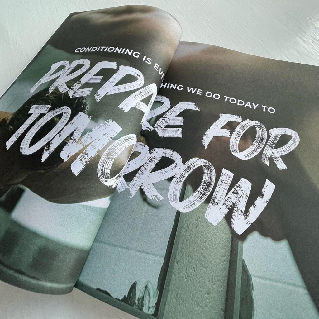
We worked closely with Caffeine & Machine to develop a series of hand painted typographic and graphic elements for their Cult of Machine clothing and accessories range. Each piece of lettering was painted by hand first, keeping things raw, punchy and full of character, before being carefully digitised for use across apparel and products. The result is a collection that feels honest, tactile and rooted in real craft, perfectly matching the attitude and community that sits at the heart of Caffeine & Machine.

Bespoke typeface painted by hand first, keeping the energy, imperfections and confidence that real brushwork brings, then carefully digitised for use across print, digital and large scale applications. The same lettering is brought back into the physical space through hand painted statements like this one, rolled out across all three Caffeine & Machine venues. The result is a clear, consistent and characterful visual voice that feels united wherever you encounter it, whether on a wall, a screen or a printed piece.
For Project 88, we were commissioned to design a distinctive logotype and curate a typographic system that would bring clarity, consistency and character to the brand. The brief was all about cohesion, creating a visual language that could live comfortably across vehicles, printed matter and digital use without losing its soul.
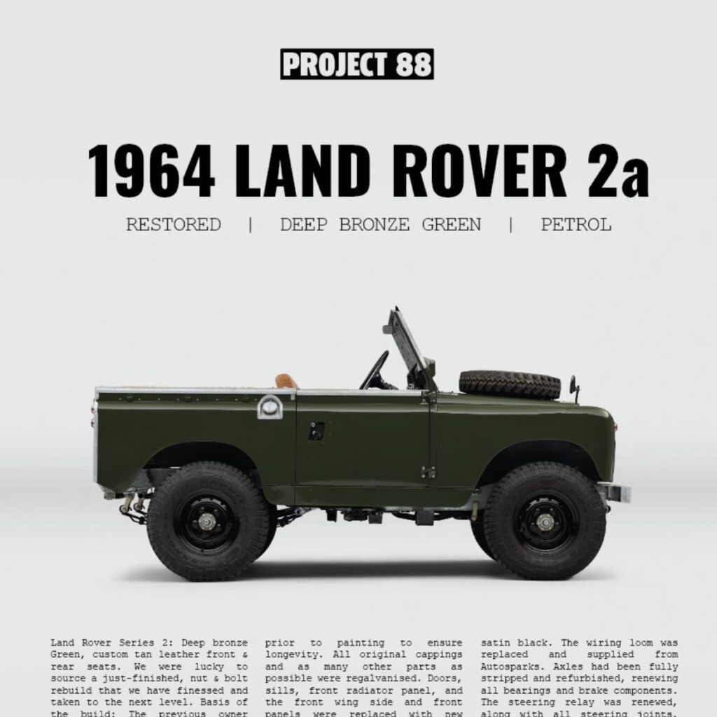
As always, the process was hands on from the start, designing the 88 logotype and curating typography; refining everything into a clear, confident system. The result is a brand identity that feels considered, timeless and purposeful, tying every touchpoint together with a strong and unified typographic voice.

“Alright Bab” started life as a hand painted piece created for a collaboration with Provide, rooted in one of Birmingham’s most recognisable and loved greetings. Painted by hand in our signature brush style, the phrase quickly took on a life of its own. Since then it has been rolled out across clothing, tea towels, bags and large scale retail applications, including wrapping an entire shop at the Bullring right next to the iconic Birmingham bull.

As part of the Birmingham Light Festival, “Alright Bab” was also brought to life in illuminated form. The piece has since become a legacy installation and now lives permanently outside Snow Hill Station, greeting visitors to our city. A simple local phrase, handled with care and craft, turned into a bold, welcoming statement for Birmingham.
Ready to bring your idea to life?
Every project starts with a conversation.